

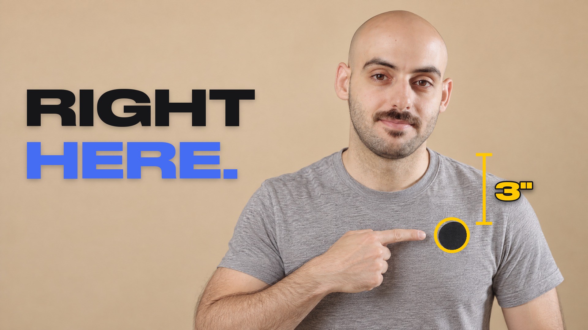
Your first t-shirt sample lands. You've waited weeks for it, you pull it on, and the logo you spent so long on is sitting in your armpit. Or it's floating somewhere in the middle of your chest, nowhere near the neat left chest placement you had on screen. The artwork was fine. What went wrong is that nobody wrote down where it goes.
Shadi Adada, co-founder and creative director of FittDesign, has spent the last 10 years helping thousands of founders build sportswear and streetwear. In this episode of FittDesign TV he goes through the placement numbers we actually use: where every measurement starts, how big and how low a full front graphic sits, the left chest numbers for a word mark and for an emblem, the full back, and the step most founders skip, which is grading the graphic across sizes.
The short answer: measure every placement from one fixed point, the center front neckline on the front and the center back neckline on the back. On a size medium, a left chest word mark sits about 3 inches down and 3.5 inches over, and a full front graphic of up to about 11 by 13 inches sits 3 to 4 inches down. Then write those numbers into your tech pack so the factory never has to guess.
Prefer to watch? The full episode is embedded at the bottom of this post, along with the complete script.
1. Pick a Point That Doesn't Move
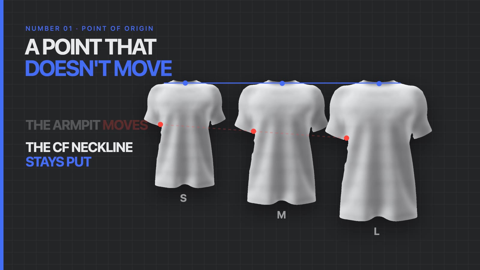
A placement is only as good as the point it's measured from. The obvious choice is the armpit, and it's the wrong one, because the armpit moves. It drops and widens as you go from a small to a medium to a large, so a logo measured from it ends up somewhere different on every size.
The point that stays put across sizes is the neckline, specifically the center front neckline. Shadi gives every placement as a distance below that point and a distance away from the garment's center front line. He thinks of it as a home address. Every destination on the shirt is given from there, and that's what keeps placements consistent across sizes, shapes and fits.
2. The Full Front Graphic
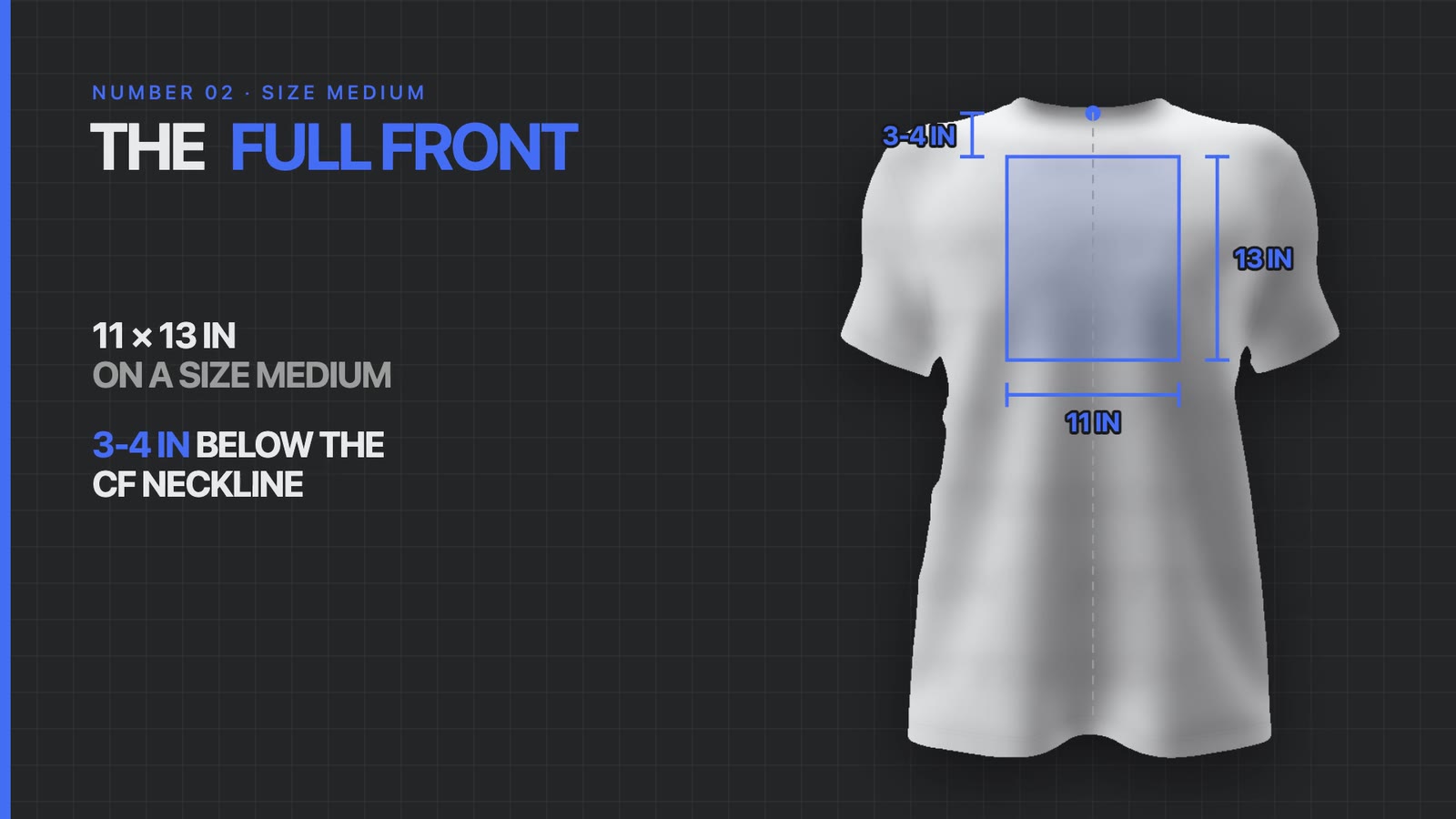
The big center front print usually works best as a portrait shape, around a 3 by 4 ratio, because the chest is narrower than the torso is long. On a size medium, Shadi tends to cap it at about 11 inches wide and 13 inches tall, placed 3 to 4 inches below the center front neckline.
Those numbers change as you scale, but one rule holds. Keep the graphic at least 2 inches away from the side seams. The armhole curves in, and anything closer than that is likely to clip into it once the shirt is worn.
3. The Left Chest, Exactly
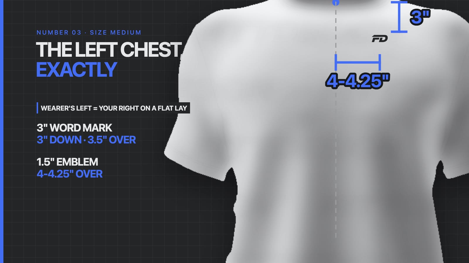
The left chest is the classic spot for a word mark or a small emblem. One thing to keep straight: the wearer's left chest is on your right when the shirt is laid flat.
Size: a word mark usually lands between 2.75 and 3.75 inches wide. The more detailed an emblem is, the larger it needs to be for the shapes to read.
Drop: about 3 inches below the center front neckline.
Distance from center: for a word mark of around 3 inches, about 3.5 inches from the garment center front. A wider logo sits a little closer to center.
A square emblem: one about 1.5 inches wide can sit further out, around 4 to 4.25 inches from center front.
Those numbers are for a size medium on an athletic to relaxed tee. An oversized or compression fit only shifts them by around 5 to 10 percent, because the visual distance from the middle of the shirt stays much the same.
Want the placements settled before your first sample?
We put every print position into the tech pack in inches, measured from the neckline, so the first sample comes back the way you pictured it.
4. The Full Back
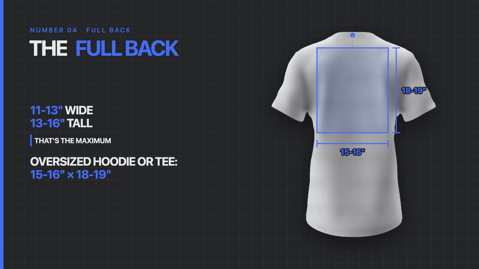
The back has more room to work with, mostly because there's less going on visually. Shadi would allow 11 to 13 inches wide and 13 to 16 inches tall as the maximum on a regular fit. On a heavily oversized hoodie or tee you can push it to around 15 to 16 inches wide and 18 to 19 inches tall.
Measure the drop from the center back neckline and keep it at least about 3 inches down. A print jammed against the collar looks out of proportion, and it leaves no room for a woven label or any stitched detail at the neck. It can also cause trouble with heat transfer prints, since some factories avoid pressing the front and the back one after the other because of the extra heat the garment takes.
5. Grade the Graphic, Not Just the Shirt
This is the one most founders never think about, and a factory won't raise it for you, because it costs them more. As the garment grades up in size, the graphic should grade up too.
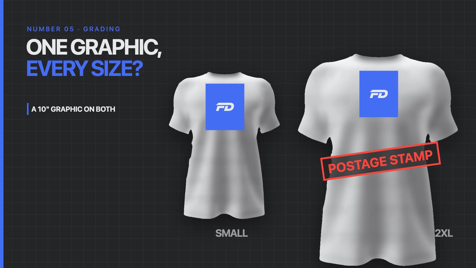
Picture a full front logo around 10 inches wide. On a small it looks great. On an oversized 2XL the same 10 inches looks like a postage stamp, small and out of proportion with everything around it.
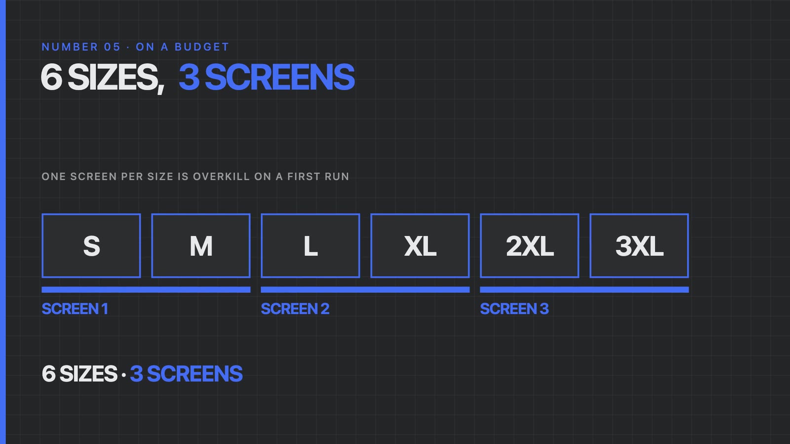
One screen or file per size is overkill on a first run, especially at a lower quantity. Shadi's suggestion is to group sizes:
Small and medium share one size of graphic.
Large and XL share a second.
The biggest sizes, 2XL and up, get a third.
Three versions can cover around six sizes. You can also run small, medium and large on one, it depends how you want to structure it. As the graphic grows, its position should move with it, usually by an inch to an inch and a half, so a larger front print drops a little lower. The same goes for the back. The one exception is a small left chest logo. Its position from the neckline barely changes between sizes, so you can keep it the same.
The Verdict
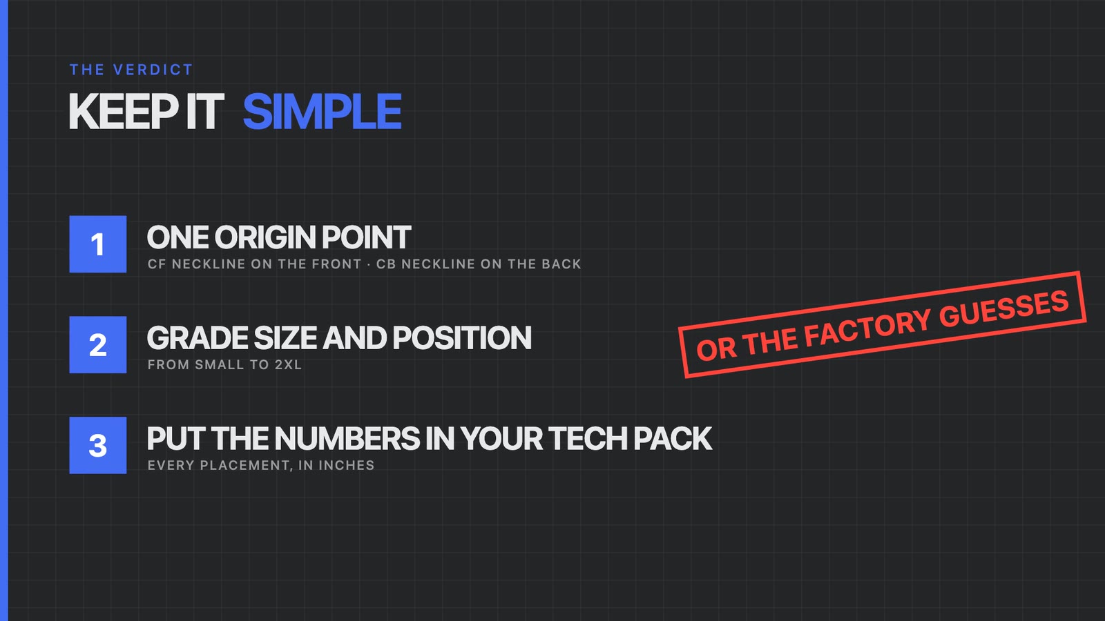
Use one origin point. The center front neckline on the front, the center back neckline on the back.
Grade the size and the position of the graphic across your size range.
Put the numbers in your tech pack. If they aren't there, the manufacturer has to guess, and their guess usually isn't what you had in your head. You end up paying for it later.
If you're also deciding how that logo will be printed, our breakdown of DTF vs screen printing covers which method holds up on which fabric.
🎬 Watch the full episode. Shadi walks through every placement above with the measurements drawn on screen: https://www.youtube.com/watch?v=hbIgp-sbf1E

Full Episode Script
This is the script of the episode as Shadi delivered it, lightly edited for reading.
Intro
So your first t-shirt sample lands and you put it on. You're excited to finally see your logo, your identity, your vision come to life. And all of a sudden you put the t-shirt on and your logo is either in your armpit, your beloved logo, your beloved vision, or it's somewhere in the middle of your chest. And it completely looks off from that perfect emblem crest placement that you had on the left chest.
Why is that? Well, this comes back to the specifics when it comes to logo and branding placement. We can't just send it to the printer, send it to the factory and hope for the best. There are specific rules for where we want to place the logo, and how far down from which specific reference points, that we have to hit and we have to specify for that perfect placement to happen.
So if you've ever had issues printing your graphics on garments, whether with a local printer or an overseas manufacturer, this is going to be the episode for you. My name is Shadi Adada, and over the last 10 years I've helped thousands of brand entrepreneurs build phenomenal sportswear apparel and streetwear apparel. We've learned what it takes to create perfect branding placements on garments, whether it's on a pair of leggings, a sports bra, a t-shirt, an oversized hoodie or a compression t-shirt: what are the rules for specifying the placement of the logo so that it always comes back looking correct, not only visually when looking at it on a flat, but also when worn.
Because something can look great design wise, but when you put it on, when it accounts for the curvature of the human body, how it's worn, different body types, it can be completely off. You can get a logo placement that looks great on a size small but looks like a postage stamp on a size 2XL. That's exactly what we're going to be discussing in today's episode, so that you know exactly how to solve it. Without further ado, let's get right into this episode.
1. Pick a point of origin
So number one, we have to understand that to get the perfect placement, we must not leave it up to chance. If we look at a specific t-shirt, for example, we need to pick a point of origin, a point that doesn't move or doesn't change across different sizes of garments. We might pick the armpit position, but that's going to change across a size small, medium and large.
So the one measurement that typically remains consistent across sizes is the neckline, specifically the front center neckline. What I like to do is always provide the measurement below the center front neckline and away from the garment center front line. Using that axis, I think of my center front neckline, where my front neckline drops and that point right in the middle, as my home base, or my address. Any destination that I give always uses that point as a reference point, and that's going to matter a lot when it comes to the different sizes of garments and the different shapes and fits of garments.
2. The full front graphic
When it comes to the types of graphics that you're thinking of, especially on a t-shirt, the first one that you might be thinking of is the full front graphic. It's the graphic on the center front of the t-shirt. In general it depends, because graphics come in all shapes and sizes, but the full front graphic typically tends to be a three by four aspect ratio, and it tends to be in a portrait position, because the width of our chest is shorter than the length of our torso for the most part, especially on a t-shirt.
So on average, what I tend to notice is that the largest size you can typically go for on a size medium tends to be around 11 inches on the chest and 13 inches on the height, and usually you want to place it around three to four inches below the center front neckline. Now again, as you scale, the measurement is going to change, but as a rule of thumb you don't want to be anywhere within two inches of the side seams, because the curve of your armhole is going to dip in. If you are within two inches of those side seams, more likely than not you're going to clip into the armhole, which is not going to be a good look.
3. The left chest
Number three is the traditional placement on the left chest. The traditional placement on the left chest can either be for a word mark or for an emblem. And again, it depends on the complexity of your emblem. The more complex the emblem, typically the slightly larger the logo needs to be for those shapes to register.
With a word mark, typically you're looking at between a 2.75 inch width and a 3.75 inch width. In terms of placement, you're looking at approximately three inches below the center front neckline, and then, depending on the width, obviously if it's a wider logo this amount is going to get less, but for a logo of around three inches you're looking at around 3.5 inches away from the garment center front for a word mark.
And of course if you have an emblem that's a bit more of a squarish shape, let's just say an inch and a half wide, this can be almost four to four and a quarter inches away from the garment center front line. This is on a size medium, typically on an athletic to relaxed t-shirt. An oversized can change a little bit, but bear in mind that with an oversized, the visual reference away from the middle of the shirt is the same as on a compression shirt, with just a little bit of variance, maybe five to ten percent, so you can apply that to the numbers.
4. The back placement
Number four is the back placement. The full back placement can be quite similar to the center front placement. On the back you typically have a bit more room, just because there's less visual clutter going on, and in general the width of it can be quite similar to the front. I would allow between an 11 to 13 inch width and a 13 to 16 inch height. That tends to be the maximum, but of course if we're going for a heavily oversized garment, like an oversized hoodie or an oversized t-shirt, you can really push that up. You can push it up to around 15, 16 inches on the width and around 18, 19 inches on the height if you need to.
In terms of placement from the center back neckline, it is important to drop at least around three inches. Anything that's stuck super close does two things. Number one, it looks super disproportionate. But it also prevents you from doing any sort of woven labels in there, or any stitch down designs right on the neckline, which can be a bit of a challenge. Also, sometimes it can prevent you from doing heat transfer prints. If you're doing two back to back heat transfer prints on the back and on the front, sometimes that excess heat can cause issues, and factories don't like to do that. They tend to avoid printing one on the front and then one on the back, so they don't have to expose the garment to that much excess heat.
5. Grade the graphic
Number five, and this is something that a lot of founders never think about. Sometimes you're almost relying on the factory to make these decisions for you, and they won't make this specific decision, because it is a bit of a hassle for them and it costs them more. And if you're not aware of it, you don't understand the value of it until you've had it.
What is this exactly? It's the fact that depending on the size of your garment, you should grade up not just the fit of the garment but also the size of the graphic. Imagine it this way. Let's just say you have a full front logo that was around 10 inches on the chest, and on a size small it looked absolutely great. But it's an oversized garment, and on a size 2XL it's going to look like a postage stamp. It's literally going to look super small and completely disproportionate.
So my recommendation would be, if you can't afford to create one for each of the different sizes, which is a little bit overkill and can be excessive, especially if you're running a lower quantity to start with, consider doing small and medium using the same mold, large and XL using a separate mold, and then maybe the bigger sizes like 2XL using a third mold. So you end up covering around six sizes with three different molds. Or you can do small, medium and large with one, or small and medium with one and large and XL with another. It depends on how you want to structure it.
And as you grade the logo, you also want to grade the positioning. This isn't always the case, but you want to grade the positioning by, let's just say, an inch to an inch and a half depending on where it's placed. If you have it on the center front neckline you're typically going to keep that consistent, but if the logo does get larger it may need to drop a little bit. Same thing on the back. The only time that branding wouldn't need to scale would be if it's quite small and placed on the left chest, because as we mentioned before, the relative position of that logo from the center front neckline and away from the garment center front is usually negligible as a reference point, so you can keep that consistent.
The verdict
So what's the verdict? Keep it simple. Consider one origin point as the position by which you always standardize where you place your logos. On the front that's your center front neckline, on the back that's your center back neckline. Consider grading the size and the positioning of the logo depending on the size of the garment. And third, if you aren't specifying these numbers in your tech pack, the manufacturer is going to have to guess. And if they guess, chances are the guess they give you isn't going to be what you want, and you end up having to pay for that down the line.
So if you want to develop your next graphic line and you really want to nail down the positioning of the graphics, to make sure everything looks proportional and exactly like what you have in your head, you can check out the link in the description to apply to work with us one on one. Within five minutes a real human will get back to you with a personalized production roadmap on how we can help you take the idea and put a physical sample in your hands in around 30 to 35 days. And guys, I say this from the very bottom of my heart, thank you so much for tuning in to this episode of FittDesign TV. Until next week's episode, stay awesome.
About FittDesign
FittDesign is a full-service sportswear design and production studio. We take brands from an idea to a properly designed product and a real sample in their hands in 30 to 35 days, with the tech packs, placements and print methods settled before anything gets made.
Ready to build your next graphic line?
Tell us what you're making and where you want your branding to sit. A real person will come back to you with a personalized production roadmap.
Get a quote → Takes 2 minutes. No obligation.


