What type of logos to Use

Did You Ever Wonder What Type of Logo Actually Works?
When you see sportswear giants like Nike, Lululemon, Gymshark, or Under Armour—there’s something about their logos that just sticks. It’s not just the aesthetics. It’s psychology, market positioning, and brand strategy—all embedded into one mark.
If you’re building an activewear brand, your logo isn’t just a visual—it’s your brand’s signature. It’s the first thing people remember and often the last thing they judge. With so many logo styles out there, how do you pick the one that truly works for your type of brand?
This article breaks down the 5 most effective logo types for activewear brands, backed by real-world usage, buyer psychology, and design logic. Not theory—just what works in the wild.

1. Wordmark Logos (Text-Only)
Used by: Gymshark, Champion, ASRV
Wordmark logos use your full brand name in a stylized typeface. Think Gymshark—their clean, all-caps typography is instantly recognizable across packaging, workout gear, and social media profiles. The name becomes the brand.
✅ Why it works: Studies show that when people see a name repeatedly, they begin to associate it with trust and familiarity. Wordmarks help you build strong verbal memory quickly—crucial in crowded online markets where recognition is everything.
✅ Pro Tip: Choose a font that mirrors your identity—bold for performance-focused brands, modern and sleek for premium collections, or even tech-inspired for futuristic lines.
🧠 Psychology Insight: Clean wordmarks feel confident. They create a visual rhythm that helps customers lock into your name. The simpler the font, the more powerful the impression.
2. Lettermark Logos (Initial-Based)
Used by: AYBL, UA (Under Armour), MP (MyProtein)
Lettermarks compress your brand identity into tight, memorable initials. Perfect for minimal activewear branding, these logos show up well on leggings, tags, and zipper pulls without distracting from the product itself.
✅ Why it works: Initials are easier to scale and ideal for brands with longer or multi-word names. They help streamline your visuals while keeping brand integrity.
✅ Psychology Insight: Humans are drawn to symmetry and geometric balance. When your initials form a visually pleasing shape—like "UA" or "MP"—they tend to stick in memory far better.
🧠 Strategic Bonus: Lettermarks can act as stepping stones. Start with your full name in a wordmark, then evolve into a lettermark for specific product lines or sub-brands.

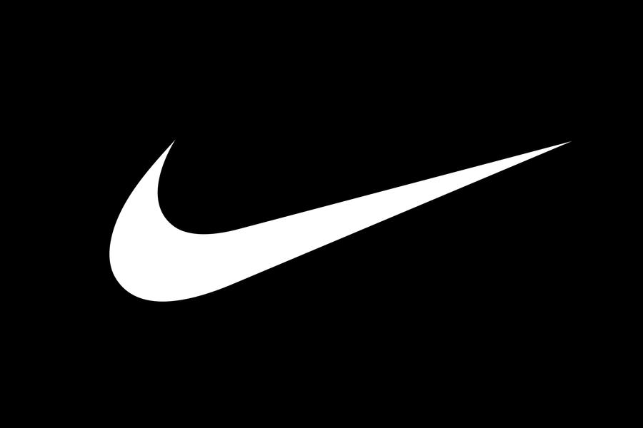
3. Icon-Based Logos (Symbols or Abstract Shapes)
Used by: Nike (Swoosh), Adidas (3 Stripes), Lululemon (Omega icon)
Icons are visual identities that don’t even need a name attached. They speak without words. A simple shape like the Nike Swoosh has become a global symbol of movement, speed, and ambition.
✅ Why it works: Icons tap directly into the part of the brain that processes imagery at lightning speed. Over time, a well-placed symbol becomes a shortcut to your brand's entire meaning.
✅ Real-World Tip: Start by pairing your icon with a wordmark until your brand has earned recognition. Once customers associate the two, the icon can stand alone on premium drops.
🧠 Emotional Hook: Strong logos don’t just show—they make people feel. A curved swoosh implies forward motion. An upward triangle suggests strength. Choose a symbol that conveys your brand’s emotion, not just its initials.
4. Combination Logos (Wordmark + Icon)
Used by: Reebok, Puma, Alphalete
This is one of the most versatile logo styles. It combines the name clarity of a wordmark with the quick-hit memorability of an icon. Think Puma’s leaping cat or Reebok’s delta symbol next to strong typefaces.
✅ Why it works: You can use the full version for your site, and isolate the icon or name for smaller applications. It’s a flexible branding system that adapts across platforms.
✅ Branding Tip: Build a responsive logo suite—one stacked version, one horizontal, one icon-only. This gives you consistency without feeling repetitive.
🧠 Performance Insight: Customers respond better to brands that show up consistently across mediums. A combination logo allows you to do that without losing legibility or impact.

5. Emblem Logos (Text Inside a Shape)
Used by: Superdry Sport, Everlast, UFC, Converse
Emblems have a strong presence. They feel bold, trustworthy, and historic. Though less common in modern sportswear, they shine in limited-edition releases, combat sports, and heritage-inspired capsules.
✅ Why it works: Emblems feel like stamps of approval. They hold visual weight, making them perfect for loyalty-based collections or collaborations.
✅ Shape Psychology: Shields = strength. Circles = unity. Squares = trust. Using emblem shapes helps encode emotional meaning into the logo itself.
🧠 Positioning Tip: Use emblems sparingly. They can feel too heavy for minimal brands—but when used right, they scream premium, exclusive, and powerful.
6.Final Thoughts: What’s the Right Logo for Your Activewear Brand?
There’s no perfect answer—but there is a smart strategy.
Starting from scratch? Use a clean wordmark with strong character.
Trying to grow? Add an icon for recognition and flexibility.
Building authority? Explore emblem formats for special drops.
🎯 Pro Branding Tip: Test your logo across real-life scenarios—on packaging, tags, Instagram thumbnails, shipping boxes, and sleeve prints. A logo that works everywhere is worth its weight in gold.
💬 Final Reminder: Your logo doesn’t need to be clever. It needs to be clear, memorable, and functional.
Let the biggest brands inspire you—but let your audience guide you.